Visualizing Dimension Coverage
Led by: Ali Sarvghad, Melanie Tory, and Narges Mahyar
Related Links: “Visualizing Dimension Coverage to Support Exploratory Analysis”
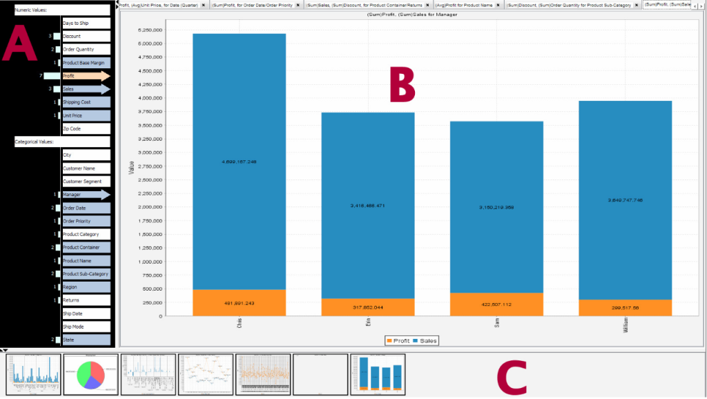
Data analysis involves constantly formulating and testing new hypotheses and questions about data. When dealing with a new dataset, especially one with many dimensions, it can be cumbersome for the analyst to clearly remember which aspects of the data have been investigated (i.e., visually examined for patterns, trends, outliers etc.) and which combinations have not. Yet this information is critical to help the analyst formulate new questions that they have not already answered. We observe that for tabular data, questions are typically comprised of varying combinations of data dimensions (e.g., what are the trends of Sales and Profit for different Regions?). We propose representing analysis history from the angle of dimension coverage (i.e., which data dimensions have been investigated and in which combinations). We use scented widgets [30] to incorporate dimension coverage of the analysts’ past work into interaction widgets of a visualization tool. We demonstrate how this approach can assist analysts with the question formation process. Our approach extends the concept of scented widgets to reveal aspects of one’s own analysis history, and offers a different perspective on one’s past work than typical visualization history tools. Results of our empirical study showed that participants with access to embedded dimension coverage information relied on this information when formulating questions, asked more questions about the data, generated more top-level findings, and showed greater breadth of their analysis without sacrificing
depth.

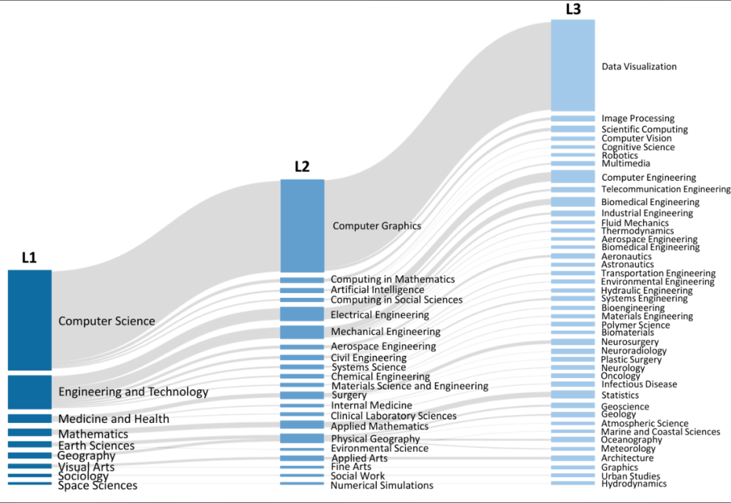
 BiblioVis Dataset

 Project Video