Designing with Pictographs
Led by: Alyxander Burns Designing with Pictographs: Envision Topics without Sacrificing Understanding
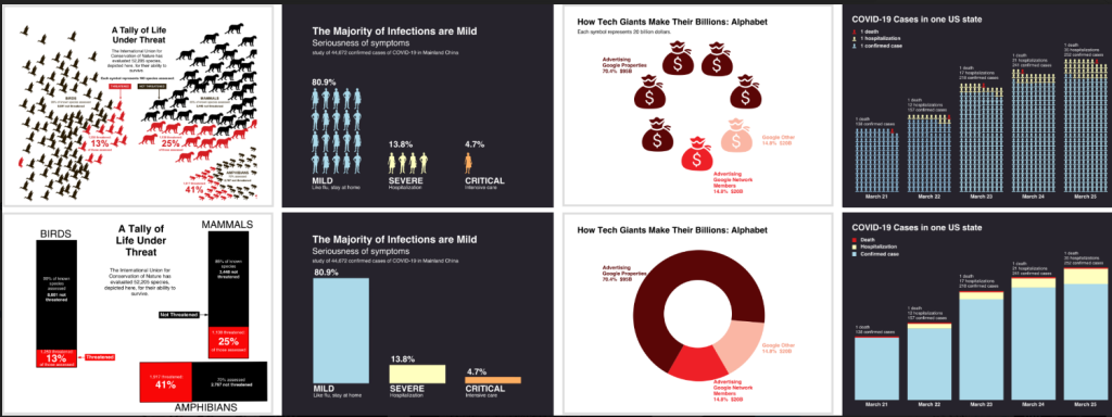
Past studies have shown that when a visualization uses pictographs to encode data, they have a positive effect on memory, engagement, and assessment of risk. However, little is known about how pictographs affect one’s ability to understand a visualization, beyond memory for values and trends. We conducted two crowdsourced experiments to compare the effectiveness of using pictographs when showing part-to-whole relationships. In Experiment 1, we compared pictograph arrays to more traditional bar and pie charts. We tested participants’ ability to generate high-level insights following Bloom’s taxonomy of educational objectives via 6 free-response questions. We found that accuracy for extracting information and generating insights did not differ overall between the two versions. To explore the motivating differences between the designs, we conducted a second experiment where participants compared charts containing pictograph arrays to more traditional charts on 5 metrics and explained their reasoning. We found that some participants preferred the way that pictographs allowed them to envision the topic more easily, while others preferred traditional bar and pie charts because they seem less cluttered and faster to read. These results suggest that, at least in simple visualizations depicting part-to-whole relationships, the choice of using pictographs has little influence on sensemaking and insight extraction. When deciding whether to use pictograph arrays, designers should consider visual appeal, perceived comprehension time, ease of envisioning the topic, and clutteredness.