Our paper on “Building Community Resiliency through Immersive Communal Extended Reality (CXR)” was recently accepted to MDPI Multimodal Technologies and Interaction 2023.
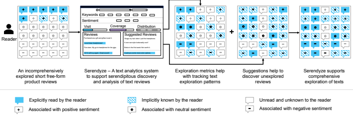
In this study, we investigate how supporting serendipitous discovery and analysis of short free-form texts, such as product review can encourage readers to explore texts more comprehensively prior to decision-making. We propose two interventions — Exploration Metrics that help readers understand and track their exploration patterns through visual indicators and a Bias Mitigation Model that maximizes knowledge discovery by suggesting readers sentiment and semantically diverse reviews. We designed, developed, and evaluated a text analytics system called Serendyze, where we integrated these interventions. We asked 100 crowd workers to use Serendyze to make purchase decisions based on product reviews. Our evaluation suggests that exploration metrics enable readers to efficiently cover more reviews in a balanced way, and suggestions from the bias mitigation model influence readers to make confident data-driven decisions. We discuss the role of user agency and trust in text-level analysis systems and their applicability in domains beyond review exploration
If you are interested in working on or learning more about this project, please contact Mahmood Jasim at mjasim@cs.umass.edu
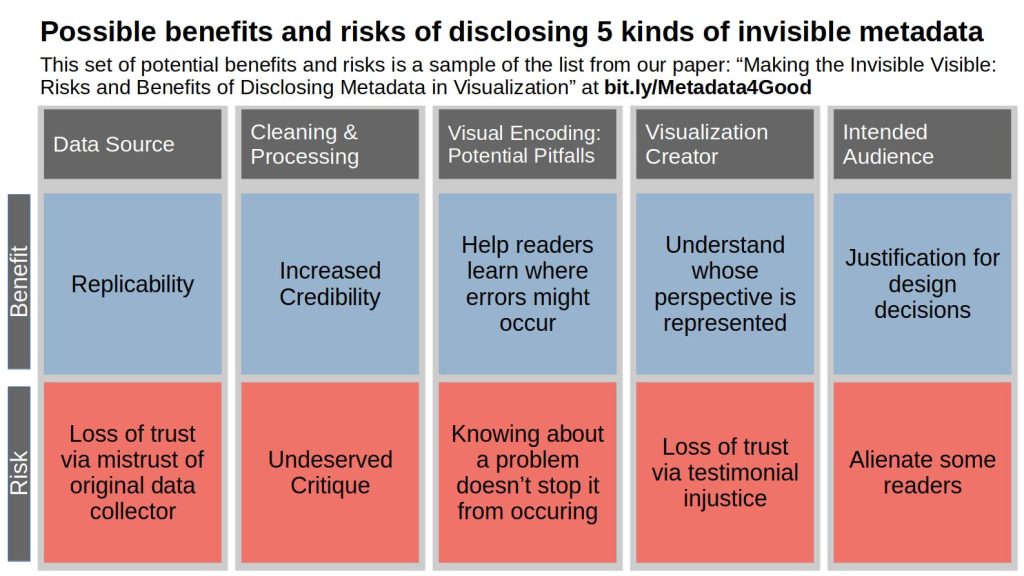
Accompanying a data visualization with metadata may benefit readers by facilitating content understanding, strengthening trust, and providing accountability. However, providing this kind of information may also have negative, unintended consequences, such as biasing readers’ interpretations, a loss of trust as a result of too much transparency, and the possibility of opening visualization creators with minoritized identities up to undeserved critique. To help future visualization researchers and practitioners decide what kinds of metadata to include, we discuss some of the potential benefits and risks of disclosing five kinds of metadata: metadata about the source of the underlying data; the cleaning and processing conducted; the marks, channels, and other design elements used; the people who directly created the visualization; and the people for whom the visualization was created. We conclude by proposing a few open research questions related to how to communicate metadata about visualizations.
If you are interested in working on or learning more about this project, please contact Alyx Burns at alyxanderbur@cs.umass.edu
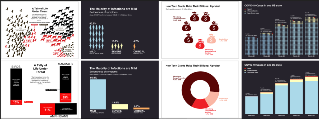
How do infographics with pictograph arrays influence understanding when compared to those that use geometric areas? The figure above displays 4 of the 6 pairs of charts evaluated in this study. Each pair consists of a chart using a pictograph array to encode a part-to-whole relationship (upper row) and a chart using a geometric area to encode the same information (lower row).
Past studies have shown that when a visualization uses pictographs to encode data, they have a positive effect on memory, engagement, and assessment of risk. However, little is known about how pictographs affect one’s ability to understand a visualization, beyond memory for values and trends. We conducted two crowdsourced experiments to compare the effectiveness of using pictographs when showing part-to-whole relationships. In Experiment 1, we compared pictograph arrays to more traditional bar and pie charts. We tested participants’ ability to generate high-level insights following Bloom’s taxonomy of educational objectives via 6 free-response questions. We found that accuracy for extracting information and generating insights did not differ overall between the two versions. To explore the motivating differences between the designs, we conducted a second experiment where participants compared charts containing pictograph arrays to more traditional charts on 5 metrics and explained their reasoning. We found that some participants preferred the way that pictographs allowed them to envision the topic more easily, while others preferred traditional bar and pie charts because they seem less cluttered and faster to read. These results suggest that, at least in simple visualizations depicting part-to-whole relationships, the choice of using pictographs has little influence on sensemaking and insight extraction. When deciding whether to use pictograph arrays, designers should consider visual appeal, perceived comprehension time, ease of envisioning the topic, and clutteredness.
If you are interested in working on or learning more about this project, please contact Alyx Burns at alyxanderbur@cs.umass.edu
Online civic discussion platforms supplement face-to-face conversations while enabling a larger number of people to participate. To understand the public’s perspectives on civic issues, civic leaders are keen to learn people’s’ emotional stances. However, online platforms deprive the civic leaders of this vital insight due to the lack of appropriate mechanisms to convey non-verbal communications, including emotional responses. Moreover, discrete emotion categories are heavily dependent on the online discussion contexts and an agreed-upon set of emotions in the online civic discussion domain is still missing. The problem is exacerbated by the lack of consensus in ways to visualize emotions. In this work, our goal is to investigate and identify a set of emotions suitable for portraying emotional responses in online civic discussions, based on our interviews with civic leaders.
If you are interested in working on or learning more about this project, please contact Mahmood Jasim at mjasim@cs.umass.edu
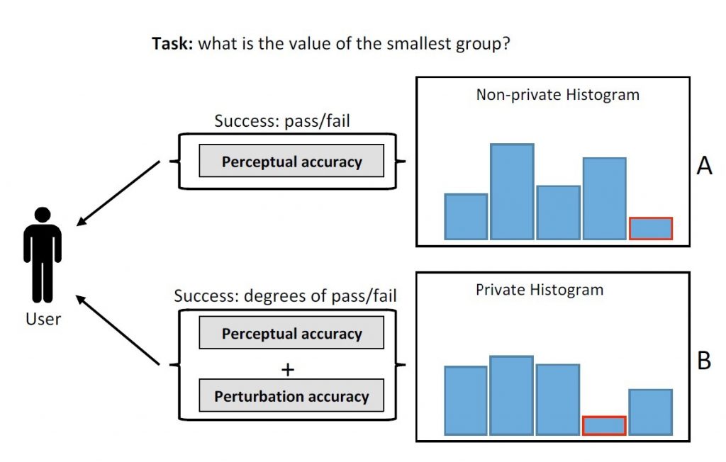
Differential privacy (DP) is an emerging technique for protecting sensitive data. This project investigates the principles of visual data exploration under differential privacy. In particular, we aim to understand if and how empirical visualization knowledge can be extended and adapted under DP.
If you are interested in working on or learning more about this project, please contact Ali Sarvghad at asarv@cs.umass.edu
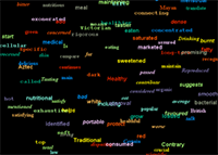
Creative-Pad is designed initially as a tool to help creative directors in an advertising agency to come up with new ideas to create an advertisement for their clients. These directors are often given a one-line brief describing a client product or service. For example, the sentence, “A car with more family space”, would describe a client’s new product which is a car targeted for family. The creative directors would have to design an advertisement suitable for promoting this product. They will need lots of ideas. Creative-Pad works by tapping into the internet as a rich source of information about all things. It takes in one or more keywords from the initial sentence and automatically searches the internet to retrieve any related information. It then processes the search results to extract interesting words and sentences. These words and sentences are then “beamed” in front of the creative directors to stimulate their thoughts for the new advertisement. An interface was specially designed to encourage creative thinking.
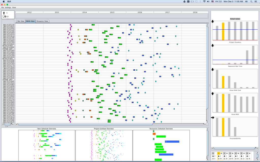
In oil and gas industry, upstream operations have large complex schedules. Creating and maintain these large schedules requires expertise and tool support. The interconnected nature of many activities makes changing/updating/optimizing schedules a sensitive task. For instance, a small change in a single activity duration can large impacts on schedule duration and operational costs. In this project, we designed a visual solution to assist schedulers in understanding the identity (what changed) and magnitude (the effect size) on a schedule from different angles.
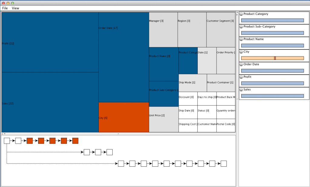
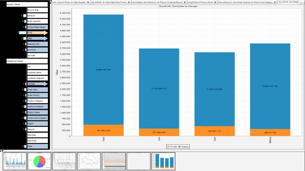
Footprint-II, a visual analysis history tool, was built to support coordination between analysts who worked in a different time/different place setting. The tool visualized the history of prior data explorations from three distinct angles: coverage of dimensions (e.g. Sales, Profit, Inventory Cost), coverage of data values, and the branching structure of the analysis. Our evaluation of this technique showed significant improvement in analysis coordination. Users of the tool better identified prior coverage by other and showed a greater focus on uninvestigated aspects of data.