Category Archives: Project

CommunityClick

Led by: Mahmood Jasim
pdf CommunityPulse: Facilitating Community Input Analysis by Surfacing Hidden Insights, Reflections, and Priorities
Talk

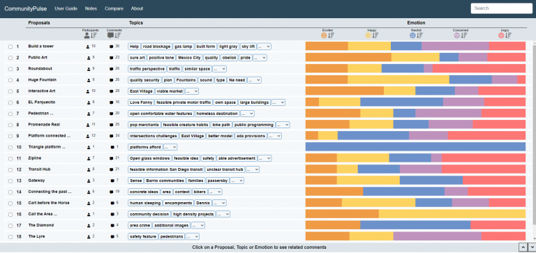
Increased access to online engagement platforms has created a shift in civic practice, enabling civic leaders to broaden their outreach to collect a larger number of community input, such as comments and ideas. However, sensemaking of such input remains a challenge due to the unstructured nature of text comments and ambiguity of human language. Hence, community input is often left unanalyzed and unutilized in policymaking. To address this problem, we interviewed 14 civic leaders to understand their practices and requirements. We identified challenges around organizing the unstructured community input and surfacing community’s reflections beyond binary sentiments. Based on these insights, we built CommunityPulse, an interactive system that combines text analysis and visualization to scaffold different facets of community input. Our evaluation with another 15 experts suggests CommunityPulse’s efficacy in surfacing multiple facets such as reflections, priorities, and hidden insights while reducing the required time, effort, and expertise for community input analysis.

Designing with Pictographs

A set of 8 infographics in two rows. Each row of charts appear identical in layout, text, and color, except the top row uses small symbols in place of the more traditional blocky shapes of the lower charts.

Led by: Alyxander Burns
Designing with Pictographs: Envision Topics without Sacrificing Understanding

Past studies have shown that when a visualization uses pictographs to encode data, they have a positive effect on memory, engagement, and assessment of risk. However, little is known about how pictographs affect one’s ability to understand a visualization, beyond memory for values and trends. We conducted two crowdsourced experiments to compare the effectiveness of using pictographs when showing part-to-whole relationships. In Experiment 1, we compared pictograph arrays to more traditional bar and pie charts. We tested participants’ ability to generate high-level insights following Bloom’s taxonomy of educational objectives via 6 free-response questions. We found that accuracy for extracting information and generating insights did not differ overall between the two versions. To explore the motivating differences between the designs, we conducted a second experiment where participants compared charts containing pictograph arrays to more traditional charts on 5 metrics and explained their reasoning. We found that some participants preferred the way that pictographs allowed them to envision the topic more easily, while others preferred traditional bar and pie charts because they seem less cluttered and faster to read. These results suggest that, at least in simple visualizations depicting part-to-whole relationships, the choice of using pictographs has little influence on sensemaking and insight extraction. When deciding whether to use pictograph arrays, designers should consider visual appeal, perceived comprehension time, ease of envisioning the topic, and clutteredness.

Collaborative Visual Data Analysis Around Large Interactive Surfaces

Led by: Narges Mahyar & Ali Sarvghad
pdf Note-taking in co-located collaborative visual analytics: Analysis of an observational study
pdf A Closer Look at Note Taking in the Co-located Collaborative Visual Analytics Process
pdf Roles of notes in co-located collaborative visualization

To gain a deeper understanding of collaborative visual data analysis around large interactive surfaces, we designed and carried out an observational user study. Co-located teams worked on collaborative visual analytics tasks using large interactive wall and tabletop displays. Our findings reinforced the importance of record keeping as an integral activity during collaborative data analysis. In addition, we characterized notes according to their content, scope, and usage, and described how they would fit into the process of collaborative data analysis. We also suggested design guidelines for note-taking functionality for co-located collaborative visual analytics tools.

CoSpaces

Led by: Narges Mahyar & Ali Sarvghad
pdf CoSpaces: Workspaces to Support Co-located Collaborative Visual Analytics
pdf Observations of Record-Keeping in Co-located Collaborative Analysis
video Project Video

CoSpaces is a prototype that is designed for collaborative data analysis on a large interactive tabletop display. It enables multiple users to simultaneously work together and create statistical charts. Some main features include the ability to record and keep track of the work by automatically saving charts, and also an embedded note-taking mechanism. Tabs are used as channels for providing awareness of collaborators’ work status. Each tab provides a portal for viewing work in progress in another workspace without any interruption. Using tabs, an analyst can view a collaborator’s current work, review work history, and study findings.

CLIP (Collaborative Intelligence Pad)

Led by: Narges Mahyar
pdf Supporting Communication and Coordination in Collaborative Sensemaking
video Project Video

CLIP is a prototype tool designed and implemented to facilitate collaborative sense-making. The focus of this project is to assist intelligence analysts to record, schematize, and share their findings and hypotheses. Utilizing peer-to-peer communication, all working instances of CLIP broadcast the latest work of an analyst to the rest of the group. Different privacy levels provide controlled sharing. CLIP supports providing awareness of common work by visually indicating common entities.

Creative-Pad

Led by: Narges Mahyar
On Two Desiderata for Creativity Support Tools

Creative-Pad is designed initially as a tool to help creative directors in an advertising agency to come up with new ideas to create an advertisement for their clients. These directors are often given a one-line brief describing a client product or service. For example, the sentence, “A car with more family space”, would describe a client’s new product which is a car targeted for family. The creative directors would have to design an advertisement suitable for promoting this product. They will need lots of ideas. Creative-Pad works by tapping into the internet as a rich source of information about all things. It takes in one or more keywords from the initial sentence and automatically searches the internet to retrieve any related information. It then processes the search results to extract interesting words and sentences. These words and sentences are then “beamed” in front of the creative directors to stimulate their thoughts for the new advertisement. An interface was specially designed to encourage creative thinking.

Color of Emotions

Led by: Mahmood Jasim

Online civic discussion platforms supplement face-to-face conversations while enabling a larger number of people to participate. To understand the public’s perspectives on civic issues, civic leaders are keen to learn people’s’ emotional stances. However, online platforms deprive the civic leaders of this vital insight due to the lack of appropriate mechanisms to convey non-verbal communications, including emotional responses. Moreover, discrete emotion categories are heavily dependent on the online discussion contexts and an agreed-upon set of emotions in the online civic discussion domain is still missing. The problem is exacerbated by the lack of consensus in ways to visualize emotions. In this work, our goal is to investigate and identify a set of emotions suitable for portraying emotional responses in online civic discussions, based on our interviews with civic leaders.

Revisiting Du Bois’ Abolitionist Visualizations

Led by: Andrew Cunningham, Alyx Burns, and Narges Mahyar
pdf Looking to the Past to Visualize the Present: Revisiting W.E.B. Du Bois’ Abolitionist Visualizations
Talk

Amidst growing civil unrest in the United States, we are seeing a new wave of abolitionist thought, which challenges us to look at systems of historic oppression and imagine how we can fundamentally restructure them to bring about an equitable justice. In this poster, we revisit visualizations made in 1900 by sociologist and civil rights activist, W.E.B. Du Bois to help us view the modern state of race in America through a historical abolitionist lens. The juxtaposition of stylistically similar charts made over 100 years apart reveals that while America has made progress toward racial justice in some areas, there is still work to be done. We call upon the visualization community to highlight the experiences of marginalized people and to take part in visualizing data related to the pervasiveness of racism.

Bloom’s Taxonomy for Evaluation

Led by: Alyx Burns
pdf How to evaluate data visualizations across different levels of understanding
pdf Video Presentation at BELIV

Understanding a visualization is a multi-level process. A reader must extract and extrapolate from numeric facts, understand how those facts apply to both the context of the data and other potential contexts, and draw or evaluate conclusions from the data. A well-designed visualization should support each of these levels of understanding. We diagnose levels of understanding of visualized data by adapting Bloom’s taxonomy, a common framework from the education literature. We describe each level of the framework and provide examples for how it can be applied to evaluate the efficacy of data visualizations along six levels of knowledge acquisition – knowledge, comprehension, application, analysis, synthesis, and evaluation. We present three case studies showing that this framework expands on existing methods to comprehensively measure how a visualization design facilitates a viewer’s understanding of visualizations. Although Bloom’s original taxonomy suggests a strong hierarchical structure for some domains, we found few examples of dependent relationships between performance at different levels for our three case studies. If this level-independence holds across new tested visualizations, the taxonomy could serve to inspire more targeted evaluations of levels of understanding that are relevant to a communication goal.

Design for San Diego (D4SD)

Led by: Narges Mahyar

We partnered with leading local organizations to drive collaboration, innovation and impact. In collaboration with City of San Diego, SCALE SD, the Design Forward Alliance, and the National Science Foundation, we launched Design for San Diego (D4SD), an online platform to engage the public in solving San Diego’s mobility challenges. The challenge is open to anyone from students and senior citizens to entrepreneurs and designers. D4SD creates unique opportunities for the public, government, academia, and industry to collaboratively design innovative civic solutions through a mixed engagement approach. Our project goal was to provide an equal voice for everyone to collaborate with other city innovators to solve the most pressing mobility-related issues in San Diego. In addition, during Fall 2010 Narges Mahyar co-taught a course called Civic Design at UCSD, where she taught the human-centered design principles and provided students with guidance and feedback on their D4SD projects.